
The Vengabus Timetable
Here's how I made it, plus some advice on what to do if something you've made goes viral.

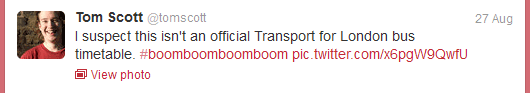
I tweeted this picture, and then it went around quite a bit of the web. It got picked up by the Poke, Time Out, @LDN and even the Daily Mirror.
Just so we're clear: I made it, with computer trickery. Here are the gory details.
How was it made?
I didn't bother to actually print a timetable; it's all done in Photoshop.
It took me half an hour to find a suitable bus stop to photograph! I wanted a road behind it, neutral lighting, and nothing reflected in the glossy front panel.
Now I had the neutral shot, I used Photoshop's perspective crop tool to pull the original timetable.
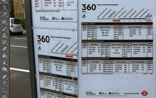
Then a few minutes with Photoshop's Content-Aware Fill gave me a blank template to work from.
The font is what really sells the joke. It's Transport for London's official font, New Johnston. I'm not really supposed to have a copy, but TfL's new beta site uses it as a web font, utterly unobfuscated. Thanks, anonymous web designer!
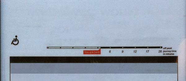
As a comparison, here's a section of the timetable rendered in the ‘public’ version of Johnston: it's just plain wrong.
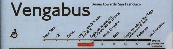
So then it was just a matter of writing a load of Vengaboys jokes. And that wasn't too difficult: I know far too many of their songs.
Finally, I added a slight monochromatic noise filter to all the text in the image, so it'd look like it was in the original photo. Then I pasted the finished timetable back where it came from, and since it's based on the original image, it fitted exactly.
It's good enough to have fooled at least one picture editor!
Side note: the aircraft and rocket-ship symbols on the final version are actually text. They're Unicode characters rendered in Microsoft's surprisingly tasteful Segoe UI Symbol font, which has lots of dingbats and Emoji in calm monochrome — unlike Apple's rather more colourful efforts.
Why did it work?
I've often professed — on stage, no less — that there's no way that you can predict what will go viral. Things that you think are brilliant may sink without a trace; cheap one-off jokes may become massive.
That said, I had a good feeling about this for a few reasons:
- It made people feel nostalgic. ‘Oh yeah! I remember that!’ is an incredibly powerful force online, and we are pretty much at peak nostalgia for the late 90s.
- The joke rewarded both casual and careful viewers. For smaller mobile screens, there's an easy ‘hah, Vengabus timetable’ joke. For those on a desktop, there's scarcely a word on that timetable that hasn't been turned into a gag.
- There were multiple jokes for all tastes. Several people loved ‘West Croydon’ in the destination list, which is your standard odd-one-out gag; others liked the slightly-too-vicious jabs at the Vengaboys' career (I quite like the band, actually); a couple of people enjoyed the tiny small print at the bottom.
Dealing with ‘going viral’

It's always nice when something takes off! It's not the biggest thing I've done online, not by a long way, but for a cheap Photoshop gag, it's done respectably well.
If you find a thing you've made going massive, here are a few tips:
Be nice to people
- Ten years ago when something I made went viral, I got a flood of email. Not any more: now it's a flood of tweets! Try to reply to as many as you can, but don't worry if sometimes it gets away from you.
- Make sure you scan your @-replies though, even if they're coming in quickly: you'll occasionally get journalists trying to get in touch with you that way.
Handling accreditation
People will, intentionally or otherwise, take your work without credit. A couple of sites did that accidentally this time, because I wasn't clear enough in my tweet.
Rather than my slightly-cryptic message, I should have made its origins clear in the original tweet and said something like ‘I've had a bit of fun with Transport for London's timetables’.
Several folks assumed I'd just snapped a picture of something real, which is not an unreasonable assumption to make. Fair play to all the sites involved, though: as soon as I pointed it out, they added a credit line or tweeted out the details. Which is nice of them: there's nothing I could really have done to stop them just nicking it.
- I was a bit tricky with the credit: it was in the small print on the sign. You should be too, if you're making images. Previously, simpler credits have been deliberately cropped out.
On YouTube, consider filing under the DMCA if someone copies your video and sticks their own adverts on it. I've done that in the past, particularly for videos where I haven't enabled ads myself.
Beware of the moochers
- For popular YouTube videos in particular, you'll get messages from so-called ‘advertising partners’ and ‘licensing agencies’. Many of these are… well, let's say they're not in your best interests. Some are — I have a productive relationship with Viral Spiral — but do your research before agreeing to anything. YouTube's own Partner Program is the best option for most.
- Equally, don't undersell yourself. News organisations will generally happily give you a credit — and make sure they do. If a TV clip-show gets in touch saying they'd like to run the thing you've made, ask ‘em what their budget is. Try not to be the first to name a price.
Going viral for the wrong reasons
- For individuals, delete and disconnect is my general advice if something's going massively wrong. The internet has a rather short attention span, and the chances are in a couple of days you'll be forgotten about. (There are, of course, exceptions to this — but waiting until it's blown over to act is still good advice.)
- For companies… well, I have a whole talk about that.
- There are ten thousand things, each as popular as yours, going massive in their own parts of the web right now. Tomorrow there'll be ten thousand more.
Enjoy it while it lasts, but remember that everything will be back to normal sooner than you might think.